Proportion photography examples
How Do I Use Rhythm and Proportion in Photography?
Using proportion in photography is an important concept to grasp. Sometimes people use distorted proportions for humorous or comic effects. However, you don’t want to accidentally use it to show a person or thing as it should be.
Proportion is about the relationship between size and space between different objects. If you’re taking a portrait, you probably don’t want to cause unwanted distortion on your subject, making them look too tall, too short, too wide or just plain weird.
People will accept a bit less than perfect proportion, but there gets to be a point where something looks unnatural. You need to know if you intend to cross that line or not.
Proportion Photography Definition
The importance of proportion in photography is usually comparing the size or amount of one thing to another. We generally think about it when talking about proportions, but by looking at how these ratios work together, you can give more meaning to your photo and ensure that everything has its place.
Two Types of Proportion in Photography
How do you tell what’s important in a photo? There are several ways to draw the eye. One of the methods is proportion or comparing the size of one object to another in a photo.
If two or more subjects are pretty much the same size, you can infer they’re equally important. If one is a bit larger, you tend to think one subject is more important than the other.
Let’s look at an example of a proportion picture.
In the photo above, we see a couple. The man is taller but not bigger in proportion. We see their relationship in size as roughly equal, meaning they’re both important to the photo.
On closer examination, we see their bodies are also proportional to what we expect. We’re not making their heads look large while the rest of their bodies look cartoonishly small. Most of what we think about as “proportional” means that the pieces fit as we’d expect them to fit, or compare to each other.
Any time we call something perfect, it brings a lot of judgment. Fortunately, talking about perfect proportion in photography means showing something as you would perceive it if you were right there looking at the subject.
Leonardo’s Vitruvian Man is an example of perfect proportion. In other words, we see the man as we would see an average person if we stood next to them (albeit I’d expect some pants on him if he were next to me).
The expected norm for perfect proportion is about seven and a half heads tall. People have different size heads, but then we expect the rest to be “in proportion” to their body parts.
That’s not to say this always aligns with everyone. Gymnasts tend to do better if they have short-lever arms and legs. No matter what your proportions, there are advantages and disadvantages to all of us. Perfect proportion aside, nobody’s truly perfect.
As portrait photographers, we generally try to ensure that we capture someone in their correct proportion. Using a wide-angle lens tends to distort their proportions. Sometimes you may do that for effect, but you don’t want to do it out of ignorance.
That’s why some focal lengths – generally over 70mm to 200mm – are considered portrait lenses.
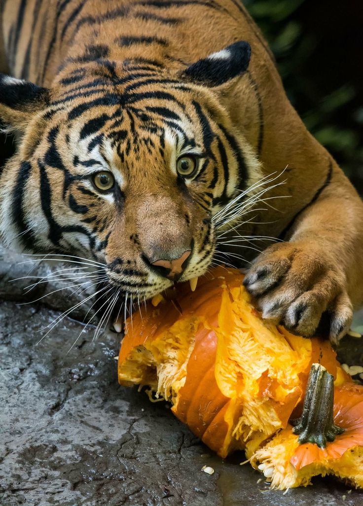
2: Distorted ProportionSometimes we want to distort proportion in photography for a specific effect. The photo below is one of our proportion photography examples.
Colleen is a friend of mine in New York City. She’s a fellow photographer and has an enormous collection of rubber ducks that often feature in her photos.
I used a wide-angle lens to take this portrait of her on top of the Empire State Building. The idea was not just to show her, but to put her in context with her home (New York City) and her favorite photo subject – rubber ducks.
Yes, her hand looks freakishly large in proportion to the rest of her. It’s a risk I didn’t mind taking to emphasize the rubber duck and capture her surroundings.
Notice that the rest of her body doesn’t really look out of proportion at all. That means you can use a wide-angle lens for an environmental portrait like this one, but you have to keep a few things in mind.
- Keep your subject’s extremities on the same plane of distance from the lens
- Anything that gets closer to the wide-angle lens also gets exaggerated
- A wide angle doesn’t necessarily distort everything
You probably aren’t thinking about it, but look at the lines in the background on the metalwork that protects people from falling to a horrible demise. It isn’t warped or curved because of the wide-angle lens. That’s not because I did any perspective control on this photo in post-processing. It’s because I combined a diagonal perspective of the background so it naturally diminishes without looking warped.
Take a photo of the same thing from a straight-on point of view with a wide-angle lens and you’ll see converging lines.
3: Using Distorted Proportion in PhotographyAnother way people commonly use distorted proportion in photography is to trick the eye.
You’ve probably seen photos where someone appears to grasp an object that you know is much larger but appears small in the photo. Sometimes it shows a person pinching or holding the Sun. Another example I recall is someone who appears to be pushing the Leaning Tower of Pisa back up so it won’t fall over.
The idea is to use distance between a person and an object to distort the proportion. Sometimes it’s funny. Sometimes it fails. At the very least, it’s an idea to keep in your bag of tricks when the occasion arises.
Rhythm in Photography
Rhythm in photography is essentially using repeated patterns in the image.
Stock Photo of Stadium SeatsPeople like repeating patterns. We love rhythm in music and visual arts. There’s something peaceful and comforting about it. Rhythm makes us happy.
However, too much rhythm gets boring. That’s why songs have a verse & a chorus, a verse and a chorus, then a bridge, before returning to the verse and chorus format. That bridge gives the song a bit of a jolt. We love the a good groove, but all good things must pass. That’s because we also love something new.
In the photo above, there’s a single red seat among all the repeating patterns of yellow seats. That break in the rhythm, the interruption in the pattern, is something interesting to people. It makes us stop and take notice.
Using rhythm in your photos is a good way to provide a sense of comfort, but you can combine that with an interruption to make something interesting.
Best of both worlds.
A pattern doesn’t have to be vertical or horizontal. You can find radial patterns in life. Everything from a ripple in a pond to a circular staircase. Toss in a leaf to disrupt the ripple, or add some people in the staircase, to create a break in the rhythm.
Use your imagination.
Composition is More Than the Rule of Thirds
The usual advice you hear about composition is to use the Rule of Thirds, look for Leading Lines, and that sort of thing.
It’s not wrong, but that advice is extremely limited. It doesn’t give you any indication of what elements or subjects in your scene will have an impact upon the psychology of your viewer. Let’s face it, some things trigger responses in the human mind. Proportion and rhythm are some of those triggers. We don’t consciously think about them when we see them, but their effect is still present.
If you’re familiar with the 10 Elements of Composition that I shared in this series, you’ll have plenty of options to consider when composing your next composition. Knowing how to create engagement or emotional response using these elements gives you an advantage over other photographers.
You may not remember all of the elements at first, but keep using them until they become second nature. You’ll spend a little time analyzing your scene before making your composition. Maybe you’ll try a few different compositions and choose the best result later when you review your photos.
Ultimately, you’ll be a more thoughtful photographer capable of creating photos that your audience will love.
10 Elements of Composition in Photography
This episode and blog post are part of a series we’re creating to expand upon this blog post.
As a list of 10 elements of composition, I thought the post touched on some useful ideas. However, I decided that it may help if we expand more on each of those elements. I hope this gives you some ideas to use in your compositions.
Scale and Proportion in Photos
Scale and proportion explored by juxtaposing Inuit men with icebergs in Ilulissat.
Here's how to use scale and proportion to add drama and enhance three dimensional space in your photos.
Scale is an important element of composition that increases the sense of three dimensional space in a photo, drawing or painting. By including a sense of scale and proportion in your photographs you may be better able to tell the story you want to tell.
How To Use Scale in Photography
I found these three likely lads near the beginning of an overnight hike I undertook on the outskirts of Ilulissat in Western Greenland.
Most of the walk skirts around the edges of the wonderful Ilulissat Icefjord. I only saw a handful of people during the entire adventure and this encounter was a great opportunity to utilize scale to illustrate the massive landscape I was exploring.
While the icebergs in this photo are relatively modest in size, when compared to many others in the Ilulissat Icefjord, adding the human element does provide an indication as to their size relative to the Inuit locals in the foreground.
Use Viewpoint To Reveal More Of The Story
Viewpoint refers to the position from which a photo is made. Achieving the best possible viewpoint can dramatically influence the mood that's expressed.
For example photographing from an elevated viewpoint can create a strong sense of distance and space.
The photo of the three Inuit guys by the shores of the Ilulissat Icefjord is a good example of how a high vantage point can be important in landscape photography.
If I’d made the photo from down at their level they would have blocked quite a bit of the background.
What I needed was to show them in relation to their surroundings and the best way to achieve that was by finding a way to visually separate them from the icebergs in the background.
By photographing from a higher vantage point I was able to photograph over the top of the three men and ensure important elements in the background were not obscured.
Needless to say that, by photographing from such an elevated viewpoint, the men are further diminished in size in relation to the icebergs.
About To Travel?
Here's What You Need
Scale, Shape And Good Timing
Fortunately there were three lads, and it’s often easier to build a good composition around odd numbered groups.
I made a few photos of this scene, all the while waiting for the guys to separate enough from each other to suggest a triangular shape.
Circles placed into triangular shapes are a great way to organize a group of people into a cohesive and harmonious composition.
The good news is that you don’t necessarily need an equilateral triangle. As long as the group in question is placed into a roughly triangular shape a better composition will be achieved.
Needless to say that, being guys, I figured at least one of them would throw a stone into the water.
It’s a small thing, but probably just enough to add a sense of action and narrative into an otherwise static image.
While a spectacular location, the bergs in the photo at the top of this post are not your classically shaped icebergs.
Likewise the contemporary clothing worn by the guys, and the fact that their backs are to the camera, make it hard to interact with them in a meaningful way.
While the location is exotic, for someone from my neck of the woods, I still had to rely on composition to produce an interesting image.
Proportion in photography showcased by a fishing boat dwarfed by icebergs, Ilulissat.
Proportion in Photography
An interesting way to enhance the sense of scale in your photos is through proportion.
The concept of proportion in photography allows you to compare the size of objects, relative to each other. In doing so you can add more or less importance to them.
Take a look at the fishing boat at the very bottom of this image. Photographed under the midnight sun the fisherman and his boat give a great indication of the truly immense scale of this environment.
The iceberg is massive, but it’s the contrast in size between iceberg and fisherman that makes this such a compelling image.
I think the metaphor is clear.
Despite the technological sophistication of the age in which we live, each of us remains insignificant compared to the awesome power of nature.
Proportion Of Color in a Photo
Images that are based, predominantly, around color can be really interesting.
When dealing with more than one color the proportion of each color, relative to each other, can affect the way we respond to the image.
For example, an equal distribution of color can imbue the image with a sense of balance and harmony.
Think about the national flags of the following countries:
Black, red and yellow for German
Red, white and green for Italy
Red, white and blue for France
All three flags express notions of order, balance and cohesion which is achieved through highly structured, symmetrical composition.
Conversely an image composed, primarily, around color can be more dynamic when there’s a difference in the relative proportions of each of the colors within the image.
Let’s take another look at my photo of the tiny fishing boat beneath the massive iceberg.
Did you notice how the bottom half of the image is illuminated by cool, bluish light reflected from the sky above?
Contrast that with the top half of the image which is lit by the warm light of the midnight sun.
That split between warm and cool colors adds to the three dimensionality and inherent drama within the scene.
While the warm light at the top of the image is glorious and uplifting, the cold colored light at the bottom of the photo is ominous and somewhat foreboding.
Attention to proportion produces a cohesive image of a family in Ilulissat.
How To use Proportion in Your Photos
Proportion refers to how well objects fit together, in relation to each other and the environment in which they're depicted.
Can you see the way circles and triangles have been used in this image of a family fishing by the shores of the Ilulissat Icefjord?
They’ll grouped into three separate triangles. It’s subtle, but it’s definitely there.
All I had to do was wait and watch, through my camera’s viewfinder, until the kids moved into positions that produced a cohesive and harmonious result.
The fact that the family group is lit by lovely, warm light is important. I wouldn’t have made the image if they weren’t well lit.
What’s more the mood that’s displayed is joyous, which many people will enjoy.
It’s a positive story and I’m doing my best to share as many such stories as I can to help you navigate your way through life.
But it’s the composition, as much as the story being told and the life affirming lighting that elevates this photo above that of a mere snapshot.
Here's some ways how you can change the relative proportion and scale of important visual elements within your own photos.
Change the angle from which you make your photo.
Photograph from an extreme angle of view.
Photograph from a very close distance to the primary focal point or subject in the image.
Move the camera up or down to raise or lower the position of the horizon in the frame.
Best Photography Course Melbourne
$330. 00
00
Knowledge versus Experience
People often confuse knowledge with experience.
In the world of photography, knowledge could be taken to mean technical prowess with camera and software.
Frankly, technical prowess isn’t always enough.
In the case of wildlife photography you’d need to combine solid technique with patience, enthusiasm and an understanding of animal behavior to be able to produce great photos on a consistent basis.
It’s that broader level of understanding that will often get you to the right location, in the right season and at the right time of day to make the most compelling image at the best moment.
I think it’s a similar scenario with street photography.
Being able to anticipate the Decisive Moment is based, largely upon experience after watching and photographing people over a considerable period of time.
Needless to say experience comes over time and, in the case of landscape photography, is acquired by being out in the world making photos under a range of lighting and weather conditions.
And, of course, experience is gained through making mistakes, learning from those mistakes and taking action to avoid them in the future.
It’s great how, by adding the human element into an image, subject matter within a simple landscape study can be better understood. I hope that’s been achieved through the photos in this post.
The human element also introduces potential variations in the story you’re able to tell.
In fact such an addition could very much effect the story or message (e.g., man’s interaction with the environment) contained within the picture.
Wouldn’t you agree?
Glenn Guy, Travel Photography Guru
CompositionGlenn GuyTravel Photography GuruScale, Ilulissat, Ilulissat Icefjord, Greenland, Travel Photography, Proportion
0 LikesWhat proportions to choose for landscape photography
Frame composition quite often distinguishes a good landscape photo from an outstanding one. There are often quoted rules that we all equally try to adhere to, such as the rule of thirds, leading lines, the golden spiral, and so on. But by focusing on what we're trying to capture in a frame, we often don't consider the frame itself. Here you will find tips on how to determine the aspect ratio of an image to have a positive effect on the composition of the frame. nine0003
The format of a photograph can play a decisive role in the composition of a scene, emphasizing the subject and removing distractions, balancing the scene or unbalancing it. Therefore, it is useful to use the viewfinder, looking through which you can preview the result of the picture, then press the shutter. Including, you should pay attention to the aspect ratio in order to optimize the composition. After all, very often the photographer states an unsuccessful compositional choice and he has to edit the aspect ratio during post-processing. nine0003
Probably, some of you are now thinking, but how to influence the composition of the frame by the image format? In this article, we will discuss several basic proportions with examples and explanations of the benefits of using each of them. And also in what situation it is appropriate to apply one or another format.
Please note that we do not consider such an argument as cropping photos in order to give the image proportions, since such manipulations damage the image. Instead, we recommend that you familiarize yourself with certain ratios, the strict adherence to which is more than advisable. nine0003
Square format - 1:1
The square format can often be used to simplify the image and give a striking effect of having the subject in the center of the frame. By keeping the width equal to the height in your photo, you will reduce the need to move left or right in the frame. In addition, the square format provides excellent opportunities to break the rules. For example, you can place the horizon in the center of the image or an object in the middle of the frame, and the composition will only intensify. Often, a 1:1 aspect ratio is used to emphasize minimalism, that is, to simplify. nine0003
1:1 aspect ratio used to simplify this image
Four thirds aspect ratio - 4:3
This aspect ratio is used by default on cameras that use four thirds of the sensor. In this case, the image is wider than it is tall, meaning that the viewer's eyes tend to move left and right across the image.
Given the fact that the height is still relatively large in relation to the width, this image is great for leading lines that take the eye across the scene from the foreground to the main interest. A wide-angle focal length is recommended for this option to capture the depth of the scene in the image without capturing unnecessary detail at the edges of each frame. nine0003
The 4:3 aspect ratio captures the smallest details of the plan and leading lines to draw attention to the image
35mm aspect ratio - 6:4 or so-called 3:2 and therefore for full-frame sensors and the APS-C format used in most Nikon and Canon cameras. In this case, the width of the image is much greater than the height, which again encourages left-to-right reading of the image, so diagonal leading lines can work well. The limitation of this ratio is that the height is much shorter than the width.
 Therefore, capturing fine foreground details with a wide-angle lens becomes more and more difficult due to the limited vertical space that you can work with. This can lead to fragmentation of objects in the frame. But the 6:4 aspect ratio is suitable for shooting scenes from the middle of the focal length range (for example, 35 mm), where there is no clear interest in the foreground. nine0003
 A 6:4 aspect ratio is used here as there is no nearby detail to capture in the foreground and the scene benefits from a wide shot.
16:9 widescreen panoramic
This format is supported by the APS sensor, which has become increasingly popular in recent years due to the prevalence of the 16:9 aspect ratio used in home TVs, computer monitors and mobile devices. This format dominates the width of the image, making it difficult to draw the viewer from the foreground into the frame, but the format is ideal for representing part of the landscape when shooting with a zoom lens at longer focal lengths. nine0003
A 16:9 wide aspect ratio has been used here to emphasize the horizontal color bars.
Panoramic format - 12:6 or 18:6 (2:1 or 3:1)
2:1 is a panoramic format supported by a number of medium format film cameras, 3:1 is typical for APS sensors. Typically, to create panoramic images, stitching 2 or more images together is used. Capturing an image with a 3:1 aspect ratio is quite difficult. Stitched shots are often shot at long focal lengths in order to bring out distant details in a landscape. In this option, there is no way to include the central detail in the foreground. nine0003
An ultra wide aspect ratio of 18:6 (3:1) was used to present this panorama of 7 stitched photographs taken with a focal length of approx. 140mm
Portrait mode
We have discussed a number of different aspect ratios in landscape format, not portrait mode. And we did this for the reason that there will be much fewer options for a successful presentation of the landscape in a “portrait” format. Because for a panoramic image, it is necessary to balance the composition throughout the frame in a proportion, for example, 6: 4. When the height of the image in many ways exceeds the width, then this is extremely difficult to do. For landscapes in "portrait" format, wider rectangles such as 4:3, 7:6, or 5:4 will do. The latter is extremely popular with professional landscape photographers using medium and large format cameras. Such formats allow the viewer's eye to slide across a balanced frame without excessive amounts of sky from left to right. nine0003
Left to right: 6:4, 4:3, 5:4. Which one looks better?
Conclusion
While the descriptions of specific uses for certain aspect ratios are provided here, it is clear that not all scenes should be strictly followed. Some images may also work fine in a ratio that is the opposite of what the rules are.
However, we hope this introduction to aspect ratio will give you something to think about when composing your shot before pressing the shutter button. It's not always ideal to fill the frame, but knowing how to find and use the right proportions effectively will allow you to perfect your landscape shots. nine0003
Telegram
Image scaling and sizing on modern SharePoint pages
Modern pages and web parts are fully responsive to various devices, so the scaling of images used in web parts depends on where they show which layout is being used and which device is viewing them. For example, modern pages look great on mobile devices, and auto-scaling images helps create an attractive look. nine0003
What image sizes work best?
Due to Quick Page Layout, there is no specific height or width in pixels, which ensures that a specific shape is maintained across devices and layouts. Images are automatically resized and cropped to display the best results across devices and layouts. However, there are some guidelines to help you make sure your images look good on your pages. nine0003
Finding the best image size depends on the factors listed here.
-
Proportions: ratio between height and width of images
-
Column layout: type and number of columns per page
-
nine0090 Web Part Layout: Web Part layout that uses an image
Proportions
Proportions are the ratio between the width and height of images. It is usually expressed in two numbers, such as 3:2, 4:3, or 16:9. The width is always the first number. For example, a 16:9 aspect ratio might be 1600 pixels wide by 900 pixels high. It can be 1920 x 1080, 1280 x 720, or any other combination of width and height that can be computed to be 16:9. Aspect ratio calculators can be found on the Internet and some photo editing tools to determine the aspect ratio of images.
In most cases, images in modern web parts work best on different layouts and devices in 16:9 or 4:3 aspect ratios, depending on the layout.
Column layouts
The page contains sections with different column types and layouts, such as full-width columns, one column, two columns, three columns, one third left and one third right column. Typically, images that need to fill the width of a column should be at least as wide as the column they are placed in. For example, an Image Web Part image in a single column must be at least 1204 pixels wide. Below are the width rules for each column layout. nine0003
| Model | Width in pixels |
| "Width" column | 1920 |
| nine0002 One column | 1204 |
| Two columns | 586 in column |
| Three columns | nine0122 |
| Third left column | 380 for the left column; 792 for right column |
| One-third right column | nine0122
Due to page responsiveness, images in full-width columns will always appear on a full-width page with auto-height based on screen size.
The height of images in other column layouts will depend on aspect ratio. Below are height and width guidelines for 16:9 aspect ratiosand 4:3 (round up/down to the nearest pixel). This helps, for example, to keep the width and height of the images properly scaled for mobile devices.
| RATIO LAYOUT | 16 x 9 Width x height in pixels | nine0200 |
|---|---|---|
| One column | 1204x677 | 1204 x 903 | nine0130
| Two columns | 586x330 | 586 x 439 |
| Three columns | 380x214 nine0125 | 380 x 285 |
| Third left column | 380 x 446 for the left column; 792 x 446 for right column | 380 x 594 for the left column; 792 x 594 for right column |
| One-third right column | 792 x 446 for the left column; 380 x 446 for right column | 792 x 594 for the left column; 380 x 594 for right column |
Web Part Layouts
The layouts in the Web Parts that you use also affect the scale of images. The following examples show the various web parts and their layouts in the same column, along with the aspect ratios used in each.
Consider this image with original aspect ratio 16:9:
The following are examples of a picture shown in a single column page layout in various Web Parts and layouts. nine0003
| Master Site Web Part | The following aspect ratios are available for tile and layer layouts:
Below is an example of an image shown in the Layers (top) and Tiles (bottom) layouts. nine0003
|
| Selected Content Web Part | 16:9 aspect ratio for Carousel, Film, and Card layouts. The following is an example of an image shown in Film (top) and Cards (bottom) layouts. nine0003
|
| Image Web Part | Images will expand to fit the width of the section containing the web part. Below is an example of image crop marks (blue lines) in 4:3
|
| Image Gallery Web Part | Different layouts use the following proportions:
Below is an example of the image shown in the Tiles (top) and Mosaic (bottom) layouts. nine0003 |
| News web part: | Depending on the layout, images in the News Web Part can be 4:3, 16:9, or 21:9. Here is an example of the images in the top story and carousel layout. nine0003 |
| Page header area | Images look best when they are in landscape or 16:9 aspect ratio or larger and are at least 1MB in size. Also, be sure to set the focal point to keep the most important part of the drawing in view, especially if the drawing is used in thumbnails, news layouts, and search results. nine0003 Example (source image 16:9) with focal point on speaker.
|
| Page thumbnail | Thumbnails can be displayed in places such as search results, highlighted content, news, and more. By default, thumbnails are rendered from the title area of the page or web part, which is in the first order on the page (for example, top left). You can override the default and change the page thumbnail. In this case, it is better to use an image with a 16:9 aspect ratio.. Example (original image 16:9)
|
| Quick Links Web Part | The Quick Links web part has six different layouts. Film, grid, button: 16:9 Compression, list, tiles: 1:1, 4:3 Below is an example of an image shown in Compressed (top) and Film (bottom) layouts.
|
 You can manually resize or crop the picture using the Image toolbar, and zoom in or out using the 24-hour mode. nine0003

 We recommend using proportions below.
 Tips:
-
When adding an image to the header area of a page or web part of the main image image, it is also best to set it as the focal point. For more information about setting the focal point for these two scenarios, see the Change the focal point of a picture web part in the Master Image Picture web part and customize the title area on the page.

- nine0002
Image guidelines for the header area of a site
In addition to the pages, additional logos or images may need to be added. Below are recommendations for the size of these elements.
| Item | nine0002 Description | Recommendations Width x height in pixels |
|---|---|---|
| Site logo | Larger logo, which may be non-square and transparent depending on the decoration added | 192x64 Format: PNG, JPEG, SVG (SVG is not allowed on sites connected to the group) |
| Website logo sketch | A sketch of a square logo that is used when submitting a site logo or in places where a square format is required This is a required item. 
|