Monitor color accuracy test
How to run a monitor color test
The world is full of color, and when it comes to seeing the world on screen, it should be captured in all its vivid glory.
Having a 4K display is all well and good, but ambient temperature changes can affect color, brightness, and other settings on your screen. That’s why it’s a good idea to carry out a monthly monitor color test.
Why is it important to run a monitor color test?
For professional graphic designers and photographers, color accuracy is essential and there are a ton of pricey gadgets available to fine-tune their monitors. But what about the rest of us? Does color really matter for the average user?
Absolutely! And here’s why.
Nowadays, so much of the entertainment we enjoy is done via our computer screen. Whether it’s marveling over your latest holiday photos or binge-watching the new must-see Netflix special, the chances are that you’ll be doing it out on a monitor.
So, you want to see the content in the way that it was created. Imagine taking an incredible panoramic shot of a turquoise sea, only to find it reproduced in a lifeless gray color.
Let’s find out how you can ensure your computer’s color accuracy is on point without having to shell out for an expensive piece of kit.
How to run a monitor color test
Monitor color tests are a quick and easy way to configure your monitor’s color accuracy, as well as other settings, like contrast and sharpness.
Before starting any test, always do the following:
- Let your computer warm up before carrying out the test (30 mins for LCD monitors, 50 for CRT monitors and 70 mins for LED monitors). This is because monitors take a short while to reach their full brightness.
- Set your monitor to its native resolution. This is the actual number of pixels physically built into your monitor. All other resolutions are ‘supported resolutions,’ but the native resolution is the one your monitor was made for.
- To do this on a PC, go to the control panel.
 Then, select settings and appearance. Select personalization, then adjust screen resolution. Click the drop-down menu and tick the resolution that’s marked ‘recommended.’
 - On a Mac, go to System Preferences, then Displays. Under Resolution, make sure Default for display is selected.
- Check your room’s lighting. You want moderate ambient lighting – neither super bright or dark, but well-lit.
- Familiarize yourself with your monitor’s display settings — such as color, contrast, brightness, etc. You’ll find them in your control panel, system preferences under the Display tab, or on the side of your monitor.
Now it’s time to run a test. Online monitor color tests offer you a quick, free calibration utility by showing you a series of test patterns. Then, depending on what you can and can’t see, you’ll adjust your monitor’s color settings, contrast, brightness, sharpness, etc.
BuddyCompany recommends the following color test websites:
- Eizo – a simple online test that enables you to test your monitor’s color, as well as other attributes like sharpness, pixels and optimum viewing angle.

- Lagom – a detailed yet relatively easy to use color test website. Good for those with a decent understanding of computers.
- W4ZT – a very simple test page that’s straightforward and quick. Ideal for those who aren’t quite so tech-savvy.
- Calibrize – not strictly an online color test – you’ll have to download this one – Calibrize helps you to adjust your monitor’s color in three simple steps.
How to calibrate your monitor color through your OS
Your operating system will have a built-in color calibration feature. Here’s how to use it.
For Windows
PC users can find a useful calibration tool in the Windows settings menu. It works much like online monitor color tests, where you look at images and adjust your monitor’s settings accordingly.
- Go to the Start menu, then PC Settings, System and then Display. Scroll down and click on Advanced display settings.
- On the next screen, click on Display adapter properties for Display 1.

- Click on the Color Management tab, then click on the Color Management box.
- Click on the Advanced tab, and select Calibrate display.
- The Display Color Calibration utility will open. Follow the onscreen instructions, and manually adjust your settings.
For Mac
For Mac users, there’s an automatic calibration tool that finds your monitor ideal color settings.
- Open your System Preferences menu then click on Displays.
- Click on the Color tab then on Calibrate. The Display Calibrator Assistant will open.
- Click continue, then on the next screen make sure the box ‘Use native white point’ is ticked and click continue again.
- At the next screen, if you’re not the only user profile on your computer tick the box saying ‘Allow others to use this calibration.’ This saves the settings for all users.

- Next, give your profile a name and click continue. Your calibration is now complete.
So, there you have it. An important yet often overlooked part of setting up your computer, monitor color tests are a simple and effective way of making sure an optimal on-screen experience.
Need more help setting up your computer? Give a BuddyCompany a call today!
Monitor Calibration Made Easy With These 5 Online Tools
Your new computer is ready and just waiting for that nudge of the mouse. Wait! Wasn't there something else? Monitor color calibration is one of the basic steps most of us forget or ignore.
Pixel perfect monitor calibration is a cardinal rule for photographers and graphic artists. If you are either of those, you know all about monitor calibration. Others should read on.
Why Is Display Calibration So Important?
A good monitor is expensive. But its impact will be lost if you don't take the pain to carefully (and intermittently) calibrate your monitor. The colors on the screen may not be the exact match of what they actually are.
Just imagine that you took a beautiful panoramic snap and downloaded it to your computer. Only to find out that the blue of the sky or the green of the grass doesn't resemble the one you saw through the viewfinder. Today, it's a lot about watching online movies, snapping digital photos and sharing image files. Color calibrating your monitor is important to get as close to the real thing as possible.
Graphics professionals will pick up serious color accuracy test tools for the job, like the Datacolor Spyder5Elite S5EL100 Monitor Calibration System. Some of you will go with the default monitor calibration software built into the OS. But we can also take some online help from these simple monitor calibration websites that have existed for a long time.
How to Calibrate Your Monitor in Windows
Conveniently, Windows comes with its down display calibration tool. Previously part of the Control Panel, Microsoft moved it to its own standalone app in Windows 11.
1. Calibrate Your Display
To open the Display Color Calibration tool, press Windows + S or open the Start menu, search for "calibrate display color," then open the matching result, and follow the on-screen instructions.
The tool will take you through basic color settings, brightness and contrast controls, and an RGB color balance adjustment. When you're done, you can opt to start the ClearType Text Tuner "to ensure that text appears correctly."
2. Tune ClearType Text
To manually open the ClearType Text Tuner, press Windows + S, search for "adjust ClearType text," then follow the on-screen instructions. On each of five screens, you'll select the text samples that look best to you.
5 Tools to Calibrate Your Monitor
1. Photo Friday
Photo Friday is a photography site. Think of the challenges involved in adjusting the brightness and contrast of a shot, and you get the reason you should calibrate your monitor. So, head to the link for their monitor calibration tool beneath the homepage, or hit the link above.
The site offers this simple one-page monitor calibration tool to adjust the brightness and contrast of your screen thanks to the gray scale tones. The idea is to tweak the monitor settings (or buttons) so that you can clearly distinguish the transition of tones from true black to true white. After calibration, the blacks should look black and without any hint of gray.
The instructions start off by telling you to dim the lights and hit F11 for viewing the gray scale chart in full-screen mode. Observe your monitor from your normal viewing distance.
2. The Lagom LCD Monitor Test Pages
The Lagom LCD Monitor Test Pages are a far more comprehensive set of tools than Photo Friday. The site includes a series of test patterns that start from checking contrast to checking for response times of your monitor. It is recommended to go through the tests in the order they are placed.
For instance, use the first few images to check brightness, contrast, and sharpness. With those set, use a latter test like the “Viewing Angle” to see if the display changes brightness or colors in the corners.
For a beginner, it might seem overwhelming. But, the test patterns come with helpful explanations. The developer also states that you can put the images on a USB drive and try them in the computer store when shopping for an LCD monitor. A 120 KB ZIP file download is included.
Fun fact: “Lagom” is Swedish for “moderate” or “just right,” which is exactly what you'll want for your monitor calibration.
3. Online Monitor Test
The Online Monitor Test website has a range of interactive tests to fix your screen colors. The menu appears when you move your mouse to the top. It starts off with a test that checks the brightness and contrast across the B/W tonal spectrum. It is similar to the test we covered on the Photo Friday website.
Next, the Color Range test checks if your monitor can smoothly produce color gradients. From the menu, you can pick different color charts. Look for “ghost images” or image trails in the Trailing test. Move the box across the screen and check if any trails are produced. The controls and options to change the color and shape of the box are placed at the bottom.
The Homogeneity test helps to pinpoint damaged pixels and faulty monitors with backlight bleeding. 1:1 Pixel mapping and testing for a blurring of Text are the last two tests on the lineup. While the former is not so much an issue with LCD computer monitors, the latter is worth a tryout if you feel that screen text is not crisp enough.
If you are setting up a dual monitor, try the Text Reproduction test across the connected displays and test for input lag.
Note: We linked to the test version that requires JavaScript above. Most browsers won't support the Flash versions of the test, but if you'd prefer to download the executable (no browser plugin required), visit the Online Monitor Test homepage
4. Monitor Calibration and Gamma Assessment
Remember, we were talking about Gamma values just a while back? Well, this whole page and the test associated with it is devoted to it. The importance and process are clearly laid out, and it's helpful for any tyro. The most important takeaway is that color saturation and hue change with gamma values.
The author also provides a series of “Gamagic” test patterns you can use to calibrate your monitor. Fall back on your eyes and adjust the gamma setting with the monitor controls until all the squares match up with their backgrounds as closely as possible.
If you want to skip the lectures and just get started testing, head to the Gamma page, and choose a target gamma from the list.
5. W4ZT
This single page screen calibration chart has few of the test images we have already covered in the earlier tools. Go through the color, gray scale, and gamma adjustments.
The one feature going for it is that it is easy to understand. Just follow the instructions, and you will be able to tune your monitor for optimum viewing.
How Is Your Own Color Perception?
All you need is a good eye. But, how is your own color perception? Take this quick (but fun) color challenge test to find out.
Also, before you start off fine-tuning your monitor, follow these three rules first:
- Turn on your monitor and allow it to warm up for 30 minutes or so.
- Set your monitor at the highest native screen resolution it supports.
- Get familiar with the display controls for your monitor.
Your monitor might also have a calibration software in your computer.
Windows 10 comes with the Windows Calibrate Display Color. You can access it from Start > Control Panel > Appearance and Personalization > Display. Or, simply search from the Cortana search box with a keyword like “calibrate.”
On the macOS Sierra, use the Display Calibrator Assistant. You can access it from Apple menu > System Preferences > Displays > Color > Calibrate. Or you can also use Spotlight.
Most users don't need to browbeat themselves over the steps or depend on third-party tools. Unless you are a professional photographer or a graphic designer who requires high-fidelity colors, these basic tools should be enough.
Image Credit: By Claudio Divizia/Shutterstock
Monitor check and adjustment tests
Welcome
monteon is a service for testing a computer monitor or mobile device display. With test screens, you can easily adjust your monitor settings to get the best picture quality. A number of tests will help you evaluate the image quality of your monitor. Even from the first test screens, you can calibrate your monitor by adjusting the monitor's brightness, contrast, clock phase, sharpness, and monitor gamma.
Tests are best viewed in dim or dark ambient light and in full screen mode. When you run tests, you will automatically be prompted to switch to full screen mode. When you move the mouse pointer, the test control panel will appear at the bottom of the screen. Using the controls on the panel, you can select the test you need, rotate the slide (if provided by the test), return to the main page or turn off full screen mode. On the left and right sides of the screen, when moving the mouse, buttons for moving between tests are displayed. For convenience, the controls disappear from the screen when there is no movement of the mouse pointer. In addition, hot keys are provided. To move between the test screens, use the Left, Right, or Space keys, or the mouse wheel. To rotate the slides - "Up" and "Down", to exit the test - "Esc".
If you have any operating system color management systems or additional graphics card correction software installed, it is recommended that you disable them first. First you need to make adjustments to the monitor settings so that its characteristics are as close to ideal as possible, and only then use some sort of color management software to compensate for any small variations or imperfections that may occur.
The following describes what and how you can check using monteon service tests, what you should pay attention to and other useful tips.
Color reproduction
This classic template is used to test the setting of primary colors and tints. Currently, there are usually no special problems with color reproduction (especially on LCD monitors), so you probably don't even need to change those settings. This test can be used to verify that the monitor displays colors correctly without any artifacts. If your monitor supports filters (or you have color filtering software), you can use these filters to check that the monitor renders colors clearly without impurities (i.e., when using a red filter, the red band should not change hue).
Dead pixels
Modern monitors use the RGB color model (an abbreviation of the English words Red, Green, Blue - red, green, blue) for color reproduction. Each screen pixel consists of three channels. Mixing these three colors at different intensities gives different colors, the same intensity - shades of gray. There are single color template screens in the color rendering test series. These tests use only one specific color channel. Separately red screen, separately green and separately blue.
These tests, in addition to the fullness of the color of the channel, allow you to check for dead pixels or, as they are also called, dead pixels . To check for broken pixels, you need to carefully examine the entire screen on a single-color test screen. It should not have black dots. You need to check each channel, because. each pixel consists of three channels. Therefore, it is not at all necessary that if everything is fine on one channel, then everything will be all right on the other. If you find a black dot on one of these tests, then you have found a dead pixel. Definitely, the presence of a defect even in one of the pixel channels will lead to a distortion of color reproduction in this pixel (point). Having a few dead pixels is normal on older monitors, but a new one shouldn't be.
This series additionally includes color mixing tests for channels: yellow (red+green), magenta (red+blue), cyan (green+blue) and white (red+green+blue).
Gradients
This series of tests presents screen patterns with smooth gradients. All gradients should be rendered smoothly, without any stripes, lines, or sudden color changes. Streaks appear when the monitor is unable to correctly reproduce true colors and smooth transitions. A good monitor will display a perfectly smooth transition.
Flicker
On many VGA monitors, the so-called clock/phase parameter needs to be adjusted. These test images are best viewed in full screen mode. At a great distance from the monitor, they should look gray. When viewed closely, a fine pattern of alternating contrast pixels (black and white) should be clearly visible.
If the synchronization is not set correctly, the images flicker or the impression of “running pixels” is created. Or if the images look solid gray (no dots visible even up close) or there are black and white stripes (vertical or curved), it also needs to be corrected.
Most monitors have an automatic setting for this setting. It is usually called "Auto" or "AutoSet". Depending on the type of monitor, there may be manual adjustment options.
Sharpness
Sharpness is very important. Sharpness is responsible for the level of clarity of the border between light and dark areas. For example, if you think that the letters of the text are blurry, then most likely the sharpness level is not enough. By adjusting a certain level of sharpness on the display, you can get a picture or text that is pleasing to the eye. But over-sharpening is just as bad as under-sharpening.
Unlike brightness, contrast, color, and hue, there is no "perfect" level of sharpness. Since, at least in part, the perception and optimal value of image sharpness depends on a number of factors, including display method, screen size, and how far away you usually are from the screen.
On the test example above, with a sufficient level of sharpness, you should clearly see small checkerboard patterns. If the sharpness is not enough, some squares merge into a solid gray color. The center circle should be clearly visible.
On another test, you should see crisp rectangles and lines without fuzzy edges, halos, or other artifacts. Diagonal lines should also be straight.
Contrast and brightness
In this series of tests on the images, you should see clear boundaries between stripes and squares. If some areas merge and become the same color or are not visible against the background at all, then it means that you need to adjust the brightness and contrast. On a good monitor, you should see equal steps of brightness across the entire range shown in the tests and in all colors.
Zone brightness
This test is a good way to check the level of overall brightness reproduction, and not a bad template for checking clarity. The center of the screen should look smooth and clean. Further from the center, closer to the edges, the contours should become more and more sharp and less smooth. Imaginary false concentric circles may appear closer to the edges of the screen. If these contours are ovoid or oval, then something is wrong. In the corners of the screen, a small, almost imperceptible drop in brightness is possible. If the decline in brightness is large or everything merges, then this is not so good.
Geometry and grids
These tests are designed to check the correct geometry and fit of the image displayed by the monitor.
Image clipping
Not every display actually shows you every pixel that the video card sends to the monitor. This test will show you how part of the image is missing. If the monitor is set up correctly, you should see a white line at the outer edge of all the numbered rectangles around the edge of the screen. If some of the rectangles are missing the outer white line at the edge of the screen, this means that the edge of the image is being cut off. The number of such a clipped rectangle indicates how many pixels are missing on that edge of the screen.
16:9 format
The test example above is designed to test widescreen displays with a 16:9 aspect ratio. Here you should see a grid of 16 identical squares horizontally and 9 identical squares vertically. Circles of the correct form should be visible in the corners. If you can't see them or they are clipped or distorted, then your monitor either does not support the appropriate mode, or you need to adjust the image scaling, which can be in the service menu of the display.
Run Tests
Check your monitor
The best present - our gift certificate Buy online, present in all retail stores.
-
How to order
-
Offer
-
Gift certificates
-
On promotional code
-
005
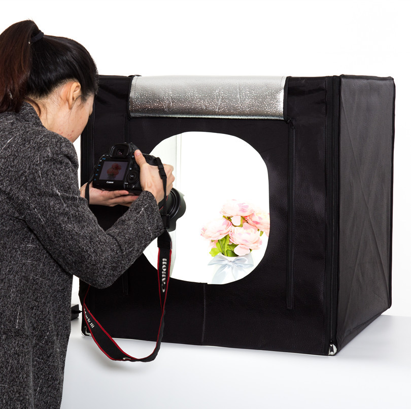
Our company uses all the necessary tools for preparing images. All devices (monitors, digital camera, with which products and models are photographed, printers, scanners) are calibrated and have individually built color profiles. Images of products on the monitor screen are compared with the originals under special lighting with a color temperature of 6500K (light source D65). Therefore, we are confident in the quality of our images.
We invite you to test your monitor with simple test images.
With the help of the following picture, you can check how well your monitor is calibrated - whether the gray balance is achieved and whether the gamma value corresponds to 2.
 2. Do not rush to be upset, the ideal picture is achievable only on calibrated hardware monitors.
 Look at the picture from a distance where the horizontal stripes in the image are not visible. In the left and right wide bands, when the monitor is properly calibrated, you will see a solid gray fill.
The whole picture should look neutral gray, without any color cast!.
If the gray bar on the left side of the picture splits into 2 separate bars, then your monitor's gamma does not match the value of 2.2 (the image may turn out to be more or less contrasty).
If you see 2 or 3 separate bands with different color shades in the right wide bar, then your video system's RGB channels are not calibrated and you will not see the colors accurately.
Many questions arise about the color of dark shades of products. A poorly calibrated monitor has poor contrast in dark colors, and often shades are indistinguishable - all dark colors turn into solid black.

Below we give the colors of our dark paints ("primers" - they usually fill the border and middle of the scarf) and a description of their color. If you do not distinguish the color tone on your monitor, you may have a low contrast and / or brightness value set in the settings.
Ground colors from left to right: Dark brown, cherry, dark blue, dark green.
Please note that the same colors are less visible on a white background - this is a feature of vision:
Additionally: check if your browser supports color management "(OGRN 1187627020921, TIN 7606117673, legal and actual address: 150054, Russia, Yaroslavl, Chkalova St., 2, office 308, and Limited Liability Company "Platochny Kaleidoscope" (OGRN 1107847356000, TIN 7802729023, legal and actual address: 601655, Russia, Vladimir region, Alexandrov, Streletskaya emb. this Agreement on the preliminary acceptance of applications for the production of products that are not in the current assortment at the request of the buyer with their subsequent sale by remote method according to the samples presented on the official website www.
 platki.ru and in the catalog of "Branded handkerchief products of the Pavlovsky Posad handkerchief manufactory".
 2. The pre-order of products is not a public offer of . The Seller may provide such an opportunity as a limited offer to some of its regular customers.
3. An offer for a pre-order of products is placed on the website platki.ru in the Pre-order section. This section is available only to those buyers for whom the Seller provides the opportunity to pre-order.
4. Pre-order includes three stages.
At the first stage, the Seller declares the pre-order open and sets the deadline for completing the collection of applications for the release of products. The buyer within the specified period can choose and order up to 5 products of the same design and type. After selecting the products, the Buyer sends an application to the Seller by means of the personal account of the site, having previously noted agreement with these conditions. Once the order has been sent, it is not possible to change the quantity of ordered products.

Upon completion of the acceptance of applications, the Seller counts their number and decides on the possibility of producing this product. If such a decision is made, the order proceeds to the next stage - Execution. If it does not accept, the pre-order for this product is cancelled.
At the stage of order execution, new orders for this product are not accepted, changes to orders made for it are not possible.
When the products are ready for sale, the third phase of the pre-order begins - Sales.
At this stage, products become available for ordering through the website in the usual way. The sale of products can be carried out in batches, as the goods arrive at the warehouse, while the opportunity to redeem the goods will be provided to buyers in the order of submission of applications. The buyer undertakes to redeem the products within 21 calendar days.
The online store sells only first-class products that have passed re-inspection. If there are products of standard and third grade in production, they can be sold to all customers in the retail trade network.

Learn more